Variable aspect-ratio dynamic image cropping with Umbraco 15
- Matt Bliss
- 03 Jan 2025
Banners using a CSS background image are a common web design feature. Often the container for those banner images will vary in aspect-ratio depending on the device or browser window size they are viewed with. The image is, in effect, dynamically cropped to fill the container. How can we improve on this dynamic cropping?
CSS Background positioning
The 'standard' centred approach
When a background image needs to fill a container we use background-size: cover;[1] in our CSS alongside background-image to define the URL of the image we want to use. This is typically used with background-position: center;[2] to centre the image in the container and ensure that any 'crop' is equally distributed.
The problem this can present is that a centre crop does not suit many images and content editors have no control over this as it is baked in at the CSS level.
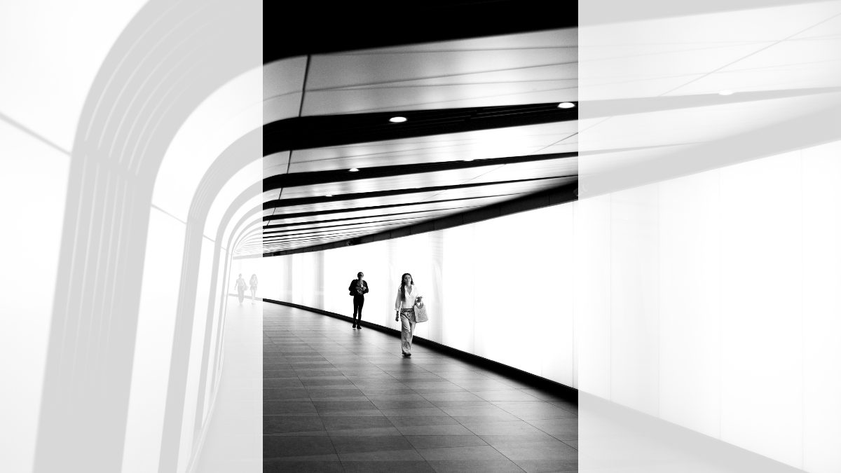
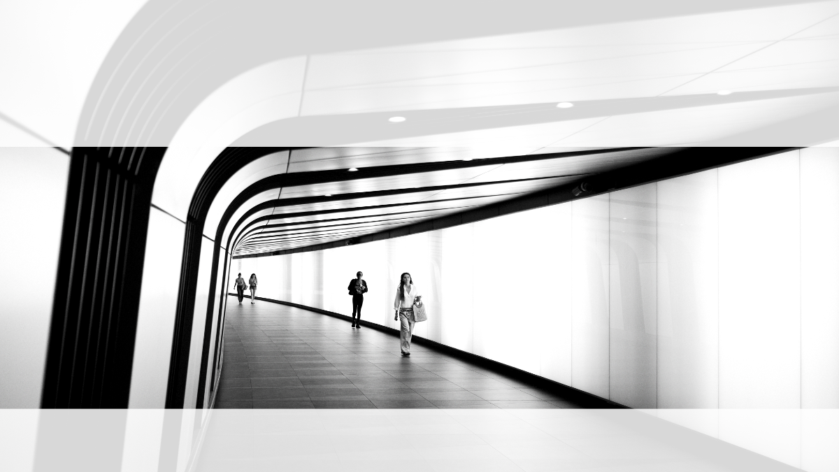
Let's take the photograph in the banner at the top of this page as an example and see what happens when we allow our CSS to take a central 'crop'.

The letterbox 'crop' doesn't look great, it has cropped too close to the feet of the person nearest to the camera. What about portrait?

The portrait 'crop' doesn't look good either, the curve of the wall is lost on the left and two people have been cut out. The focus of the image now shifts to the person nearest the camera rather than the strong architectural design of the curved walkway.
The 'custom' image specific approach
If, however, we don't want to 'crop' the image at the centre then we need to specify how to position the background. This can be done using percentages, for example background-position-x: 30%; and background-position-y: 60%; or the shorthand notation background-position: 30% 60%;[2]
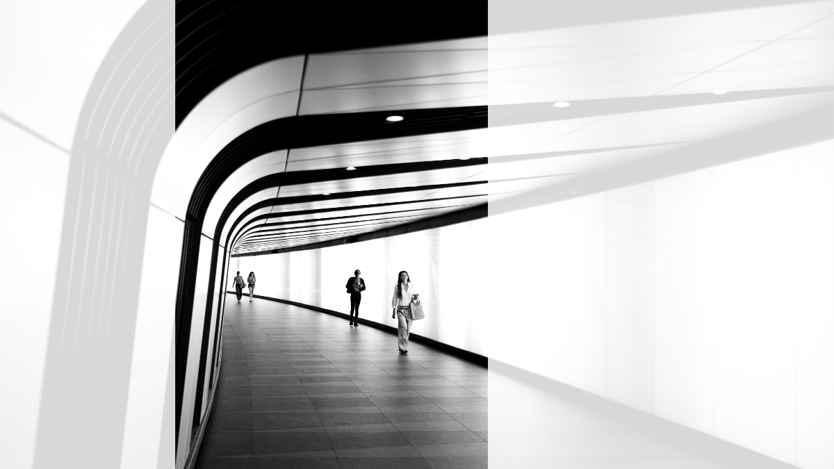
With the above CSS a container that varies in aspect ratio for different display sizes would position the same image correctly whatever the shape of the container as shown in the two images below.


So a little well established CSS can handle the positioning of our images nicely in those variable size and aspect ratio containers. We now have well composed dynamic crops whatever the container size. Is there a way we can content manage this?
Content Managing the dynamic 'crop'
Umbraco media focal point
The first question I asked myself was can the focal point in the Umbraco Media library be used for specifying the desired CSS positioning? It turns out it can and it works pretty well.
The method for specifying the CSS position is very close to the method used to specify the focal point in Umbraco.
- Both CSS and the focal point picker work from left to right for the x axis and both work from top to bottom for the y axis.
- The range for CSS is a percentage and the range for the focal point picker is a decimal value between zero and one, so conversion from one to another is simple multiplication.
The same figures applied to both methods will result in slightly different crops, as the calculation method[3] being applied is different in each case. A later article will discuss how these can be corrected to reduce those subtle differences, but for now we have a very workable solution using the raw figures from the focal point multiplied up to give CSS percentages. In practice, these slight differences in calculation method can be overcome by dragging the focal point slightly further from the centre than you would for traditional Umbraco crops.
Consuming the focal point
Let's make some assumptions.
- We are using Umbraco 15
- We are using Models Builder
- We are using the Media Picker Property editor to select our image[4]
- We are using the Local Crop rather than the Global Crop[5]
- We have checked the 'Enable Focal Point' for our picker[6]
So, based on these assumptions, how do we get the focal point in our view and use the correct styles? Let's look at some code:
using Umbraco.Cms.Core.PropertyEditors.ValueConverters;

public static class FocalPointHelper
{
    public static int LeftPercent(this ImageCropperValue.ImageCropperFocalPoint? focalPoint)
    {
        return (int)((focalPoint?.Left ?? 0.5m) * 100);
    }

    public static int TopPercent(this ImageCropperValue.ImageCropperFocalPoint? focalPoint)
    {
        return (int)((focalPoint?.Top ?? 0.5m) * 100);
    }
}
These two methods extract the Left and Top percentages from an ImageCropperValue, convert them from a double in the range 0 to 1 to an int percentage, and default to 50% if the focal point object is null.
using Umbraco.Cms.Core.Models;

public static class BackgroundImageHelper
{
    public static string? BackgroundPositionStyle(this MediaWithCrops? image)
    {
        if (image is null) return null;
        var focalPoint = image.LocalCrops.FocalPoint;
        return $"background-position: {focalPoint.LeftPercent()}% {focalPoint.TopPercent()}%;";
    }
}
This method outputs our chosen focal point as background-position: 30% 60%; which we can inject straight into the style attribute of the container in our view. As we will already be setting a background image URL in the style attribute, I have added the following extension methods to the helper:
    public static string? BackgroundUrlStyle(this MediaWithCrops? image)
    {
        return image is null
            ? null
            : $"background-image: url('{image.MediaUrl()}');";
    }

    public static string? BackgroundImageStyle(this MediaWithCrops? image)
    {
        return image is null
            ? null
            : $"{image.BackgroundUrlStyle()} {image.BackgroundPositionStyle()}";
    }
Updating our views
In views where we currently have the following:
<div class="our-container"
    style="background-image: url('@Model.Image.Url()');">
</div>
We can now use the BackgroundImageStyle extension method and instead write this:
<div class="our-container"
    style="@Model.Image.BackgroundImageStyle()">
</div>
With the following in our CSS we can crop all our background images correctly based on their individual focal point selected in the picker. They will default to a centre focal point with the CSS and then our inline style tag can override that with our preferred positioning.
.our-container {
    background-size: cover;
    background-position: center center;
}
Putting the editor in control
This approach is simple to implement, it gives content editors even greater control when handling background images, and is well suited to variable aspect ratio containers. I hope you find it a helpful technique to improve editor experience in Umbraco sites
Footnotes
background-position https://developer.mozilla.org/en-US/docs/Web/CSS/background-position
The calculation method for CSS position percentage offsets https://developer.mozilla.org/en-US/docs/Web/CSS/background-position#regarding_percentages